CLIENT: HILTON MOTIF SEATLE
Brand Identity | Logo Refinement | Color + Typography Systems | Custom Illustration | Print-Ready Men
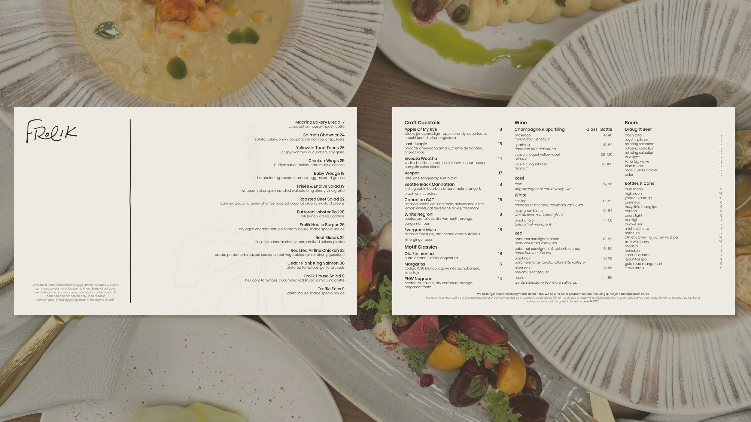
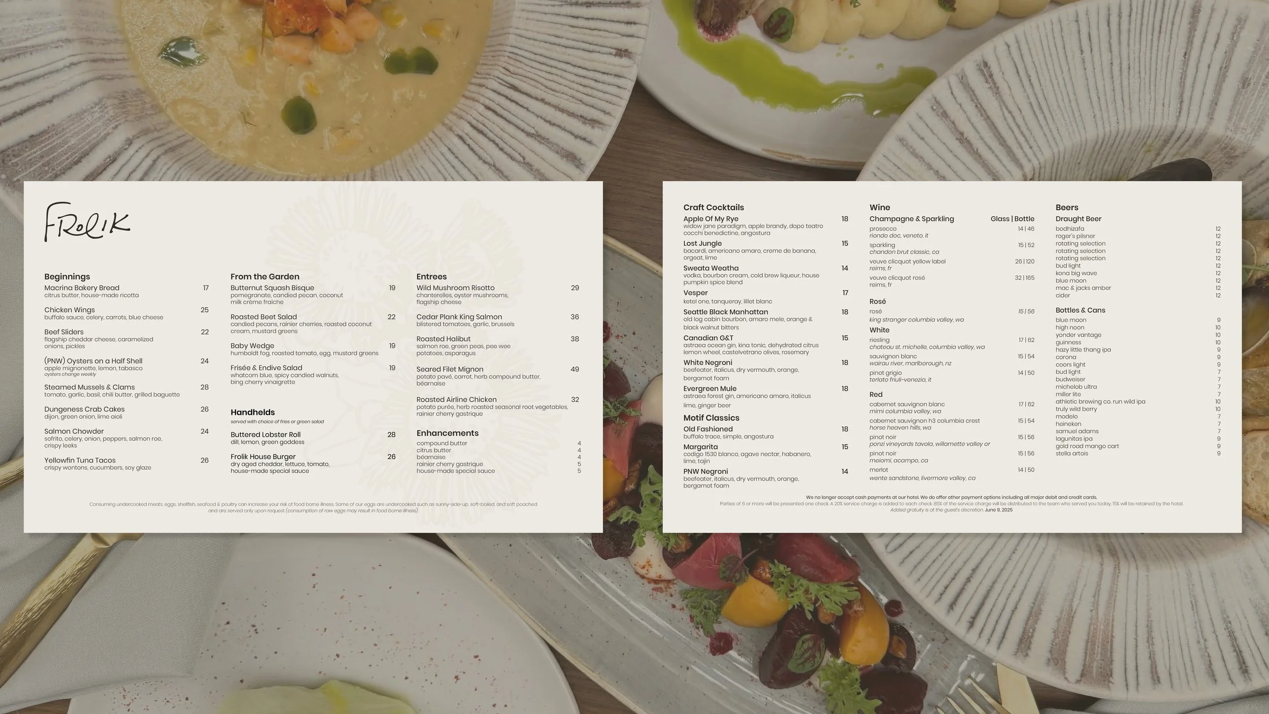
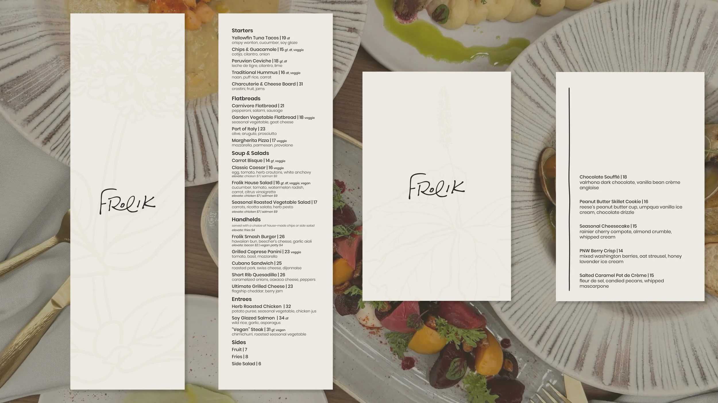
Motif Seattle's rooftop restaurant undergoes a complete repositioning, moving away from casual games and cocktails toward a serious Pacific Northwest dining destination built around seasonality and the Cascadia landscape.

Hilton's Brand F&B team shaped the concept around seasonal seafood and local purveyors. With the interior and menu direction set, the visual identity was the last piece needed to bring it all together.
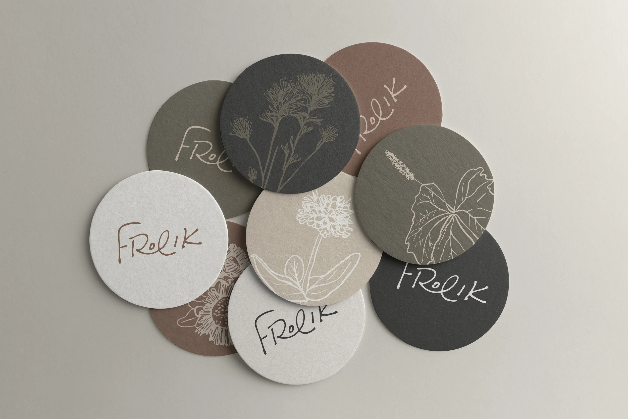
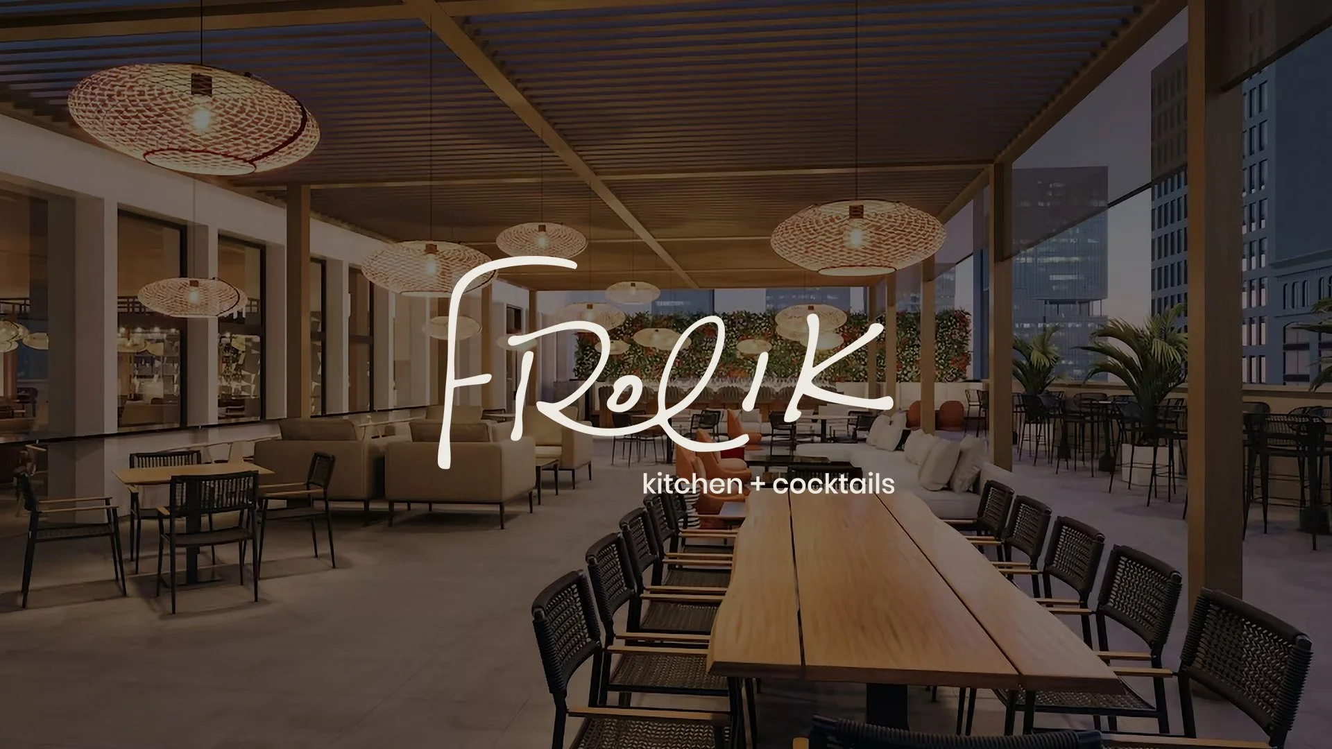
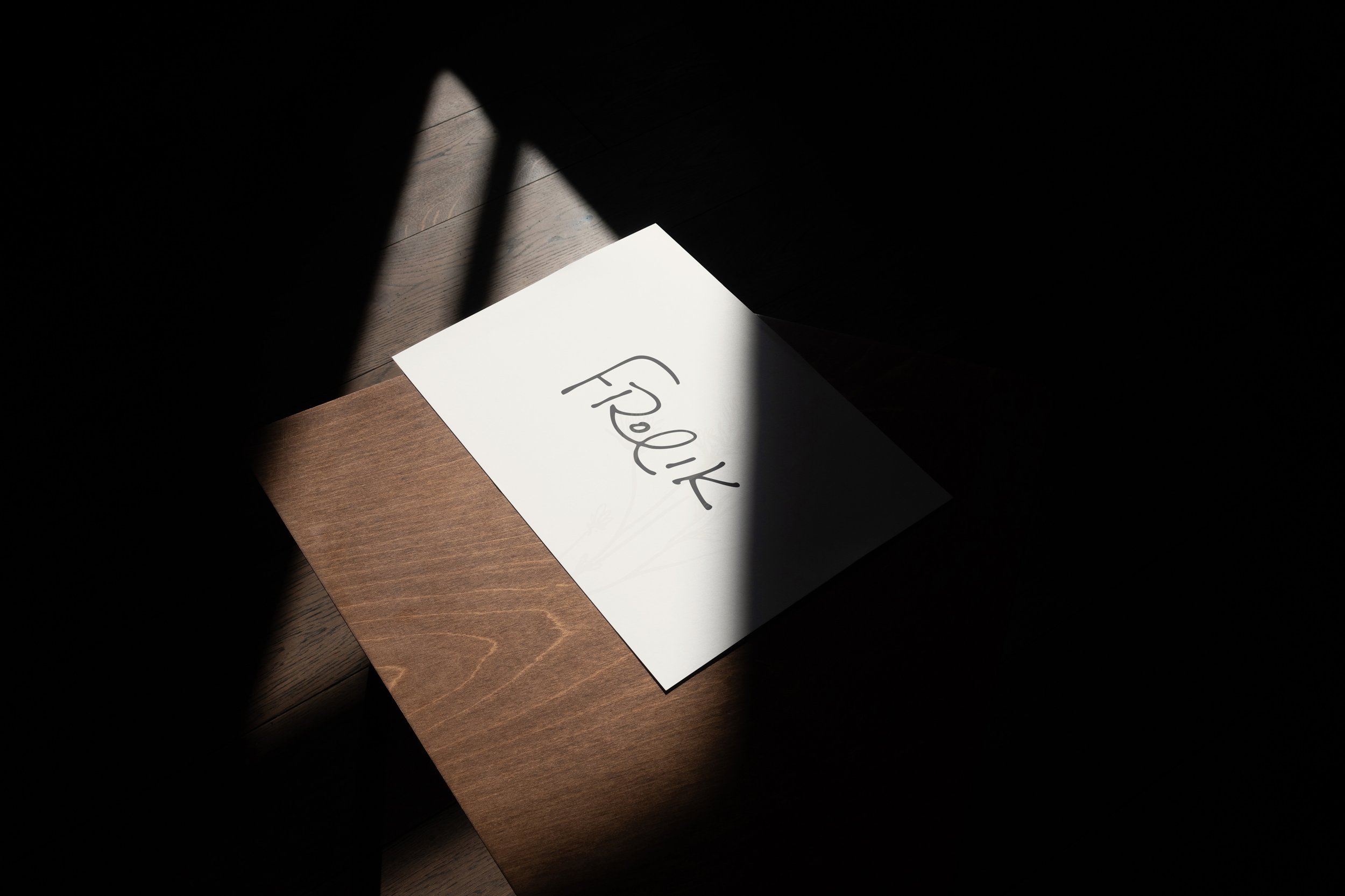
The name and logo were staying. To create a more grown up version of the mark, the exclamation point was dropped and the lowercase wordmark was upgraded to capitals. The hotel ultimately kept its original logo, but where the mark alone couldn't carry the repositioning, the system did.
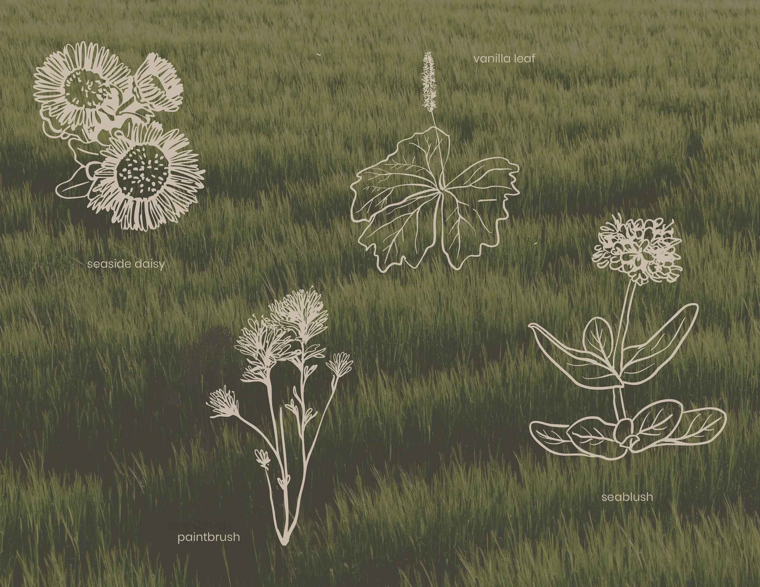
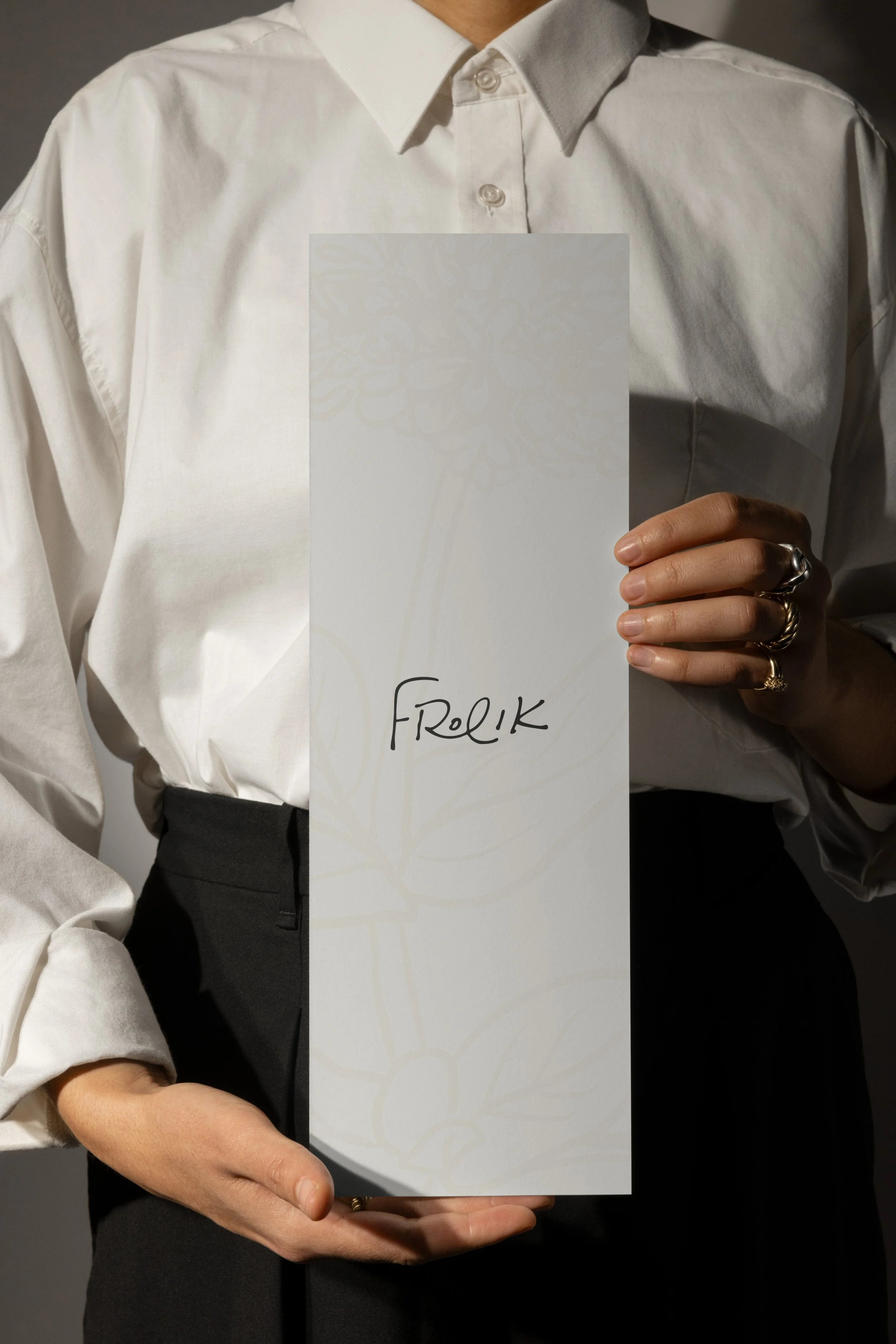
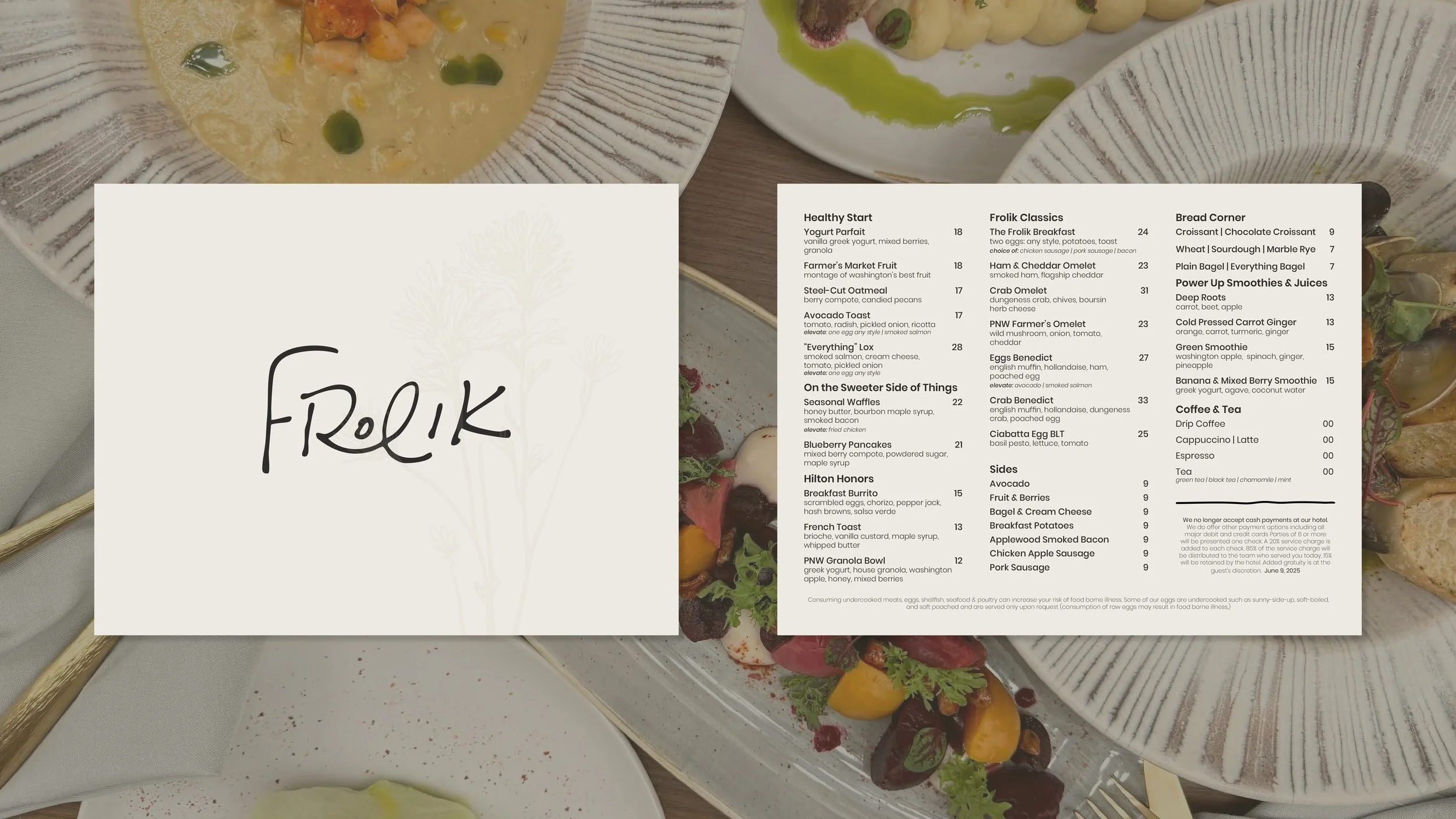
The existing typography left little room to organize menu sections or build a balanced page. A geometric sans with a full weight range was chosen to carry hierarchy across every format. Drawing from Hilton's own concept language, a palette of earthy Pacific Northwest tones and a suite of hand illustrated native botanicals became the system's primary visual element. Appearing across the menus as watermarks, the illustrations were present enough to add warmth, restrained enough to let the food speak first.