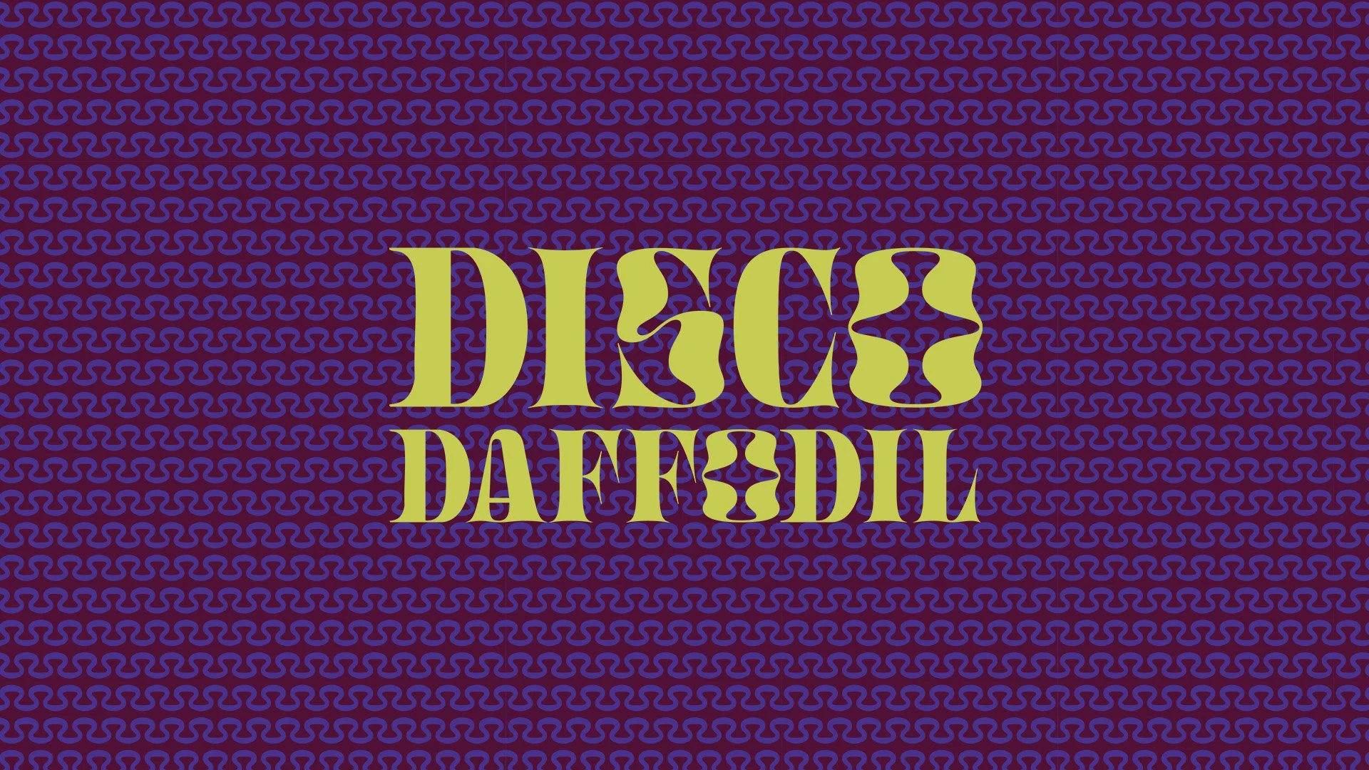
CLIENT: DISCO DAFFODIL
Brand Strategy | Tone of Voice | Visual Identity | Logo System | Color Palette | Typography | Custom Pattern | Photography Direction | Brand Application
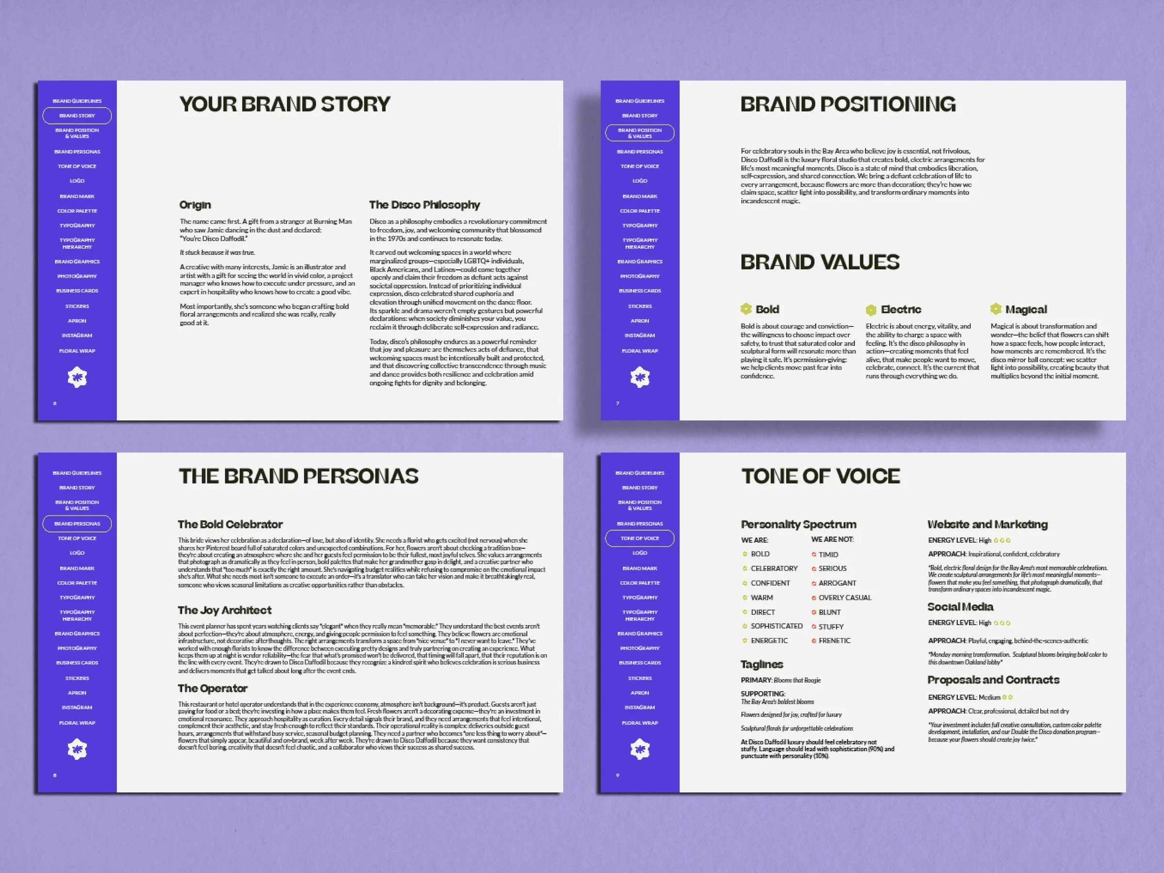
Disco Daffodil is a Bay Area luxury floral studio built around a philosophy as specific as its founder: that joy is radical, that flowers are emotional infrastructure, and that a brand should feel as alive as the arrangements it represents.
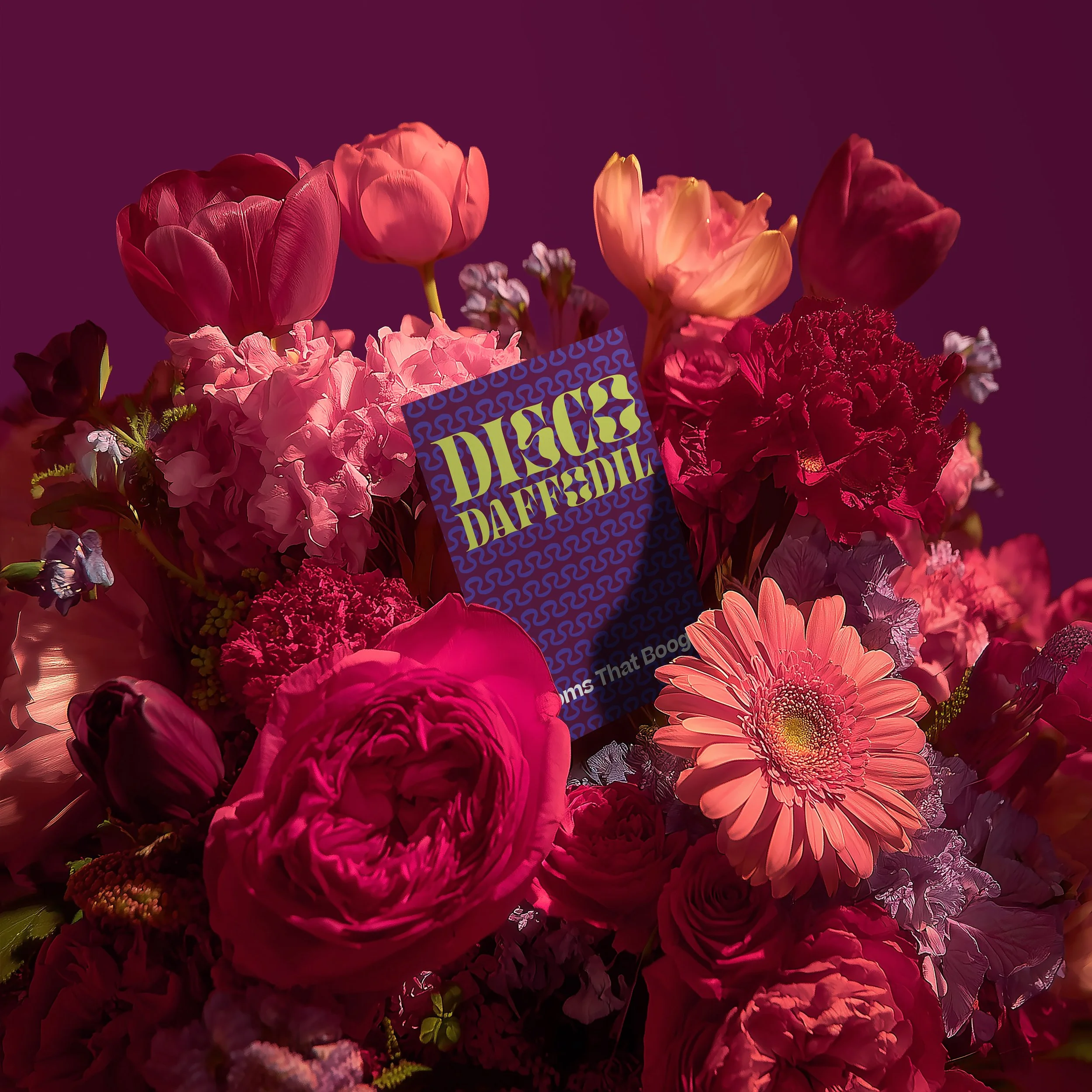
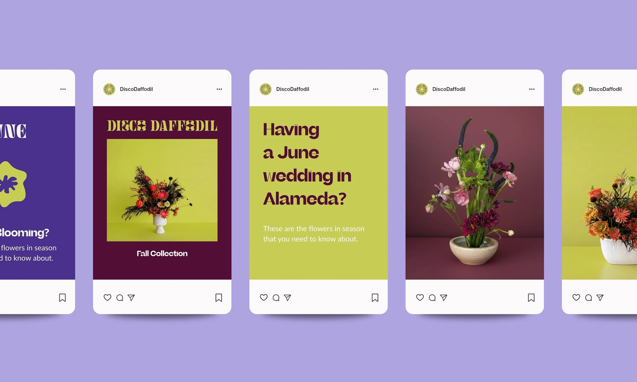
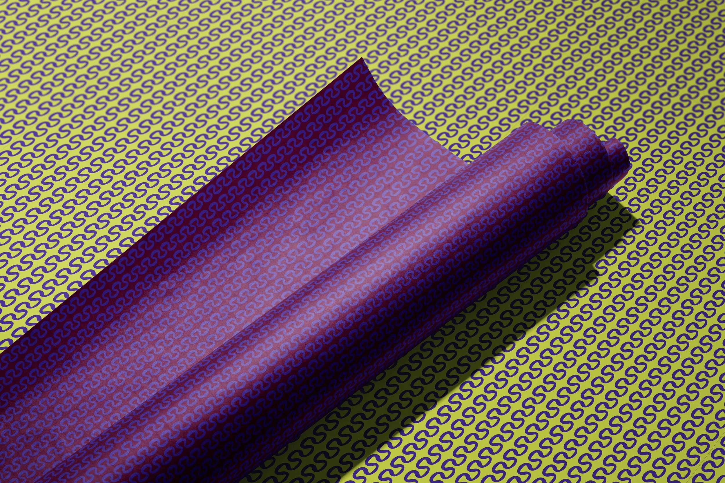
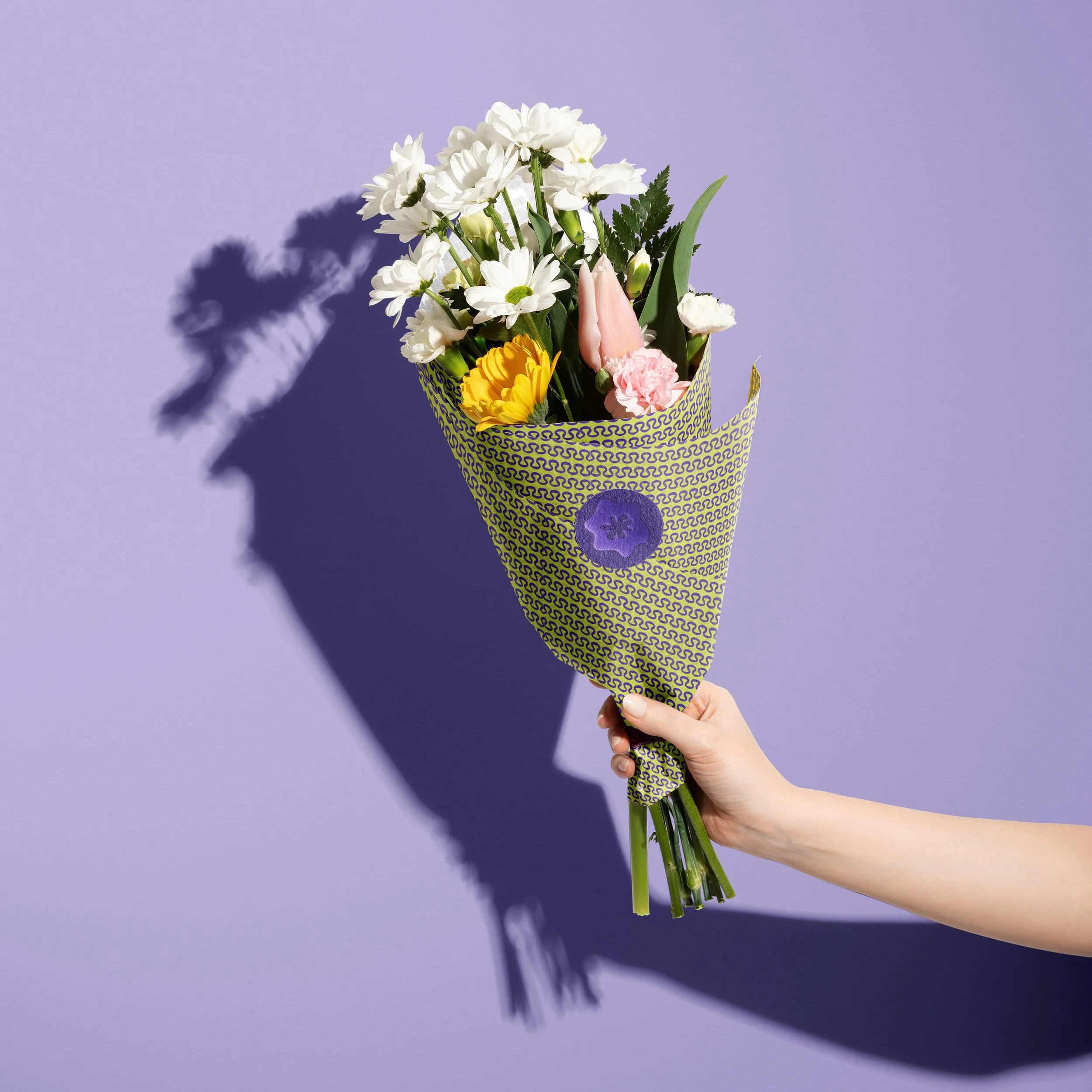
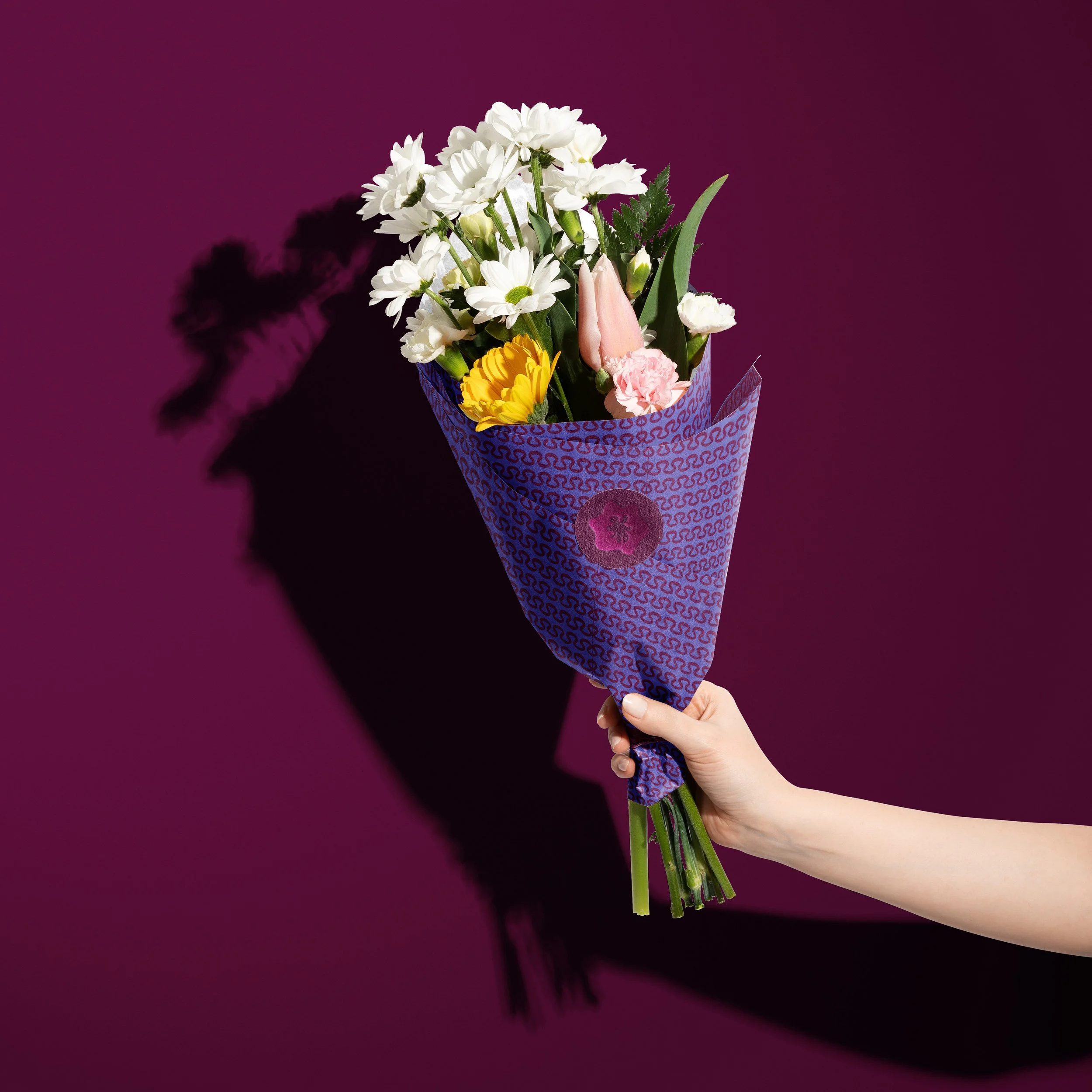
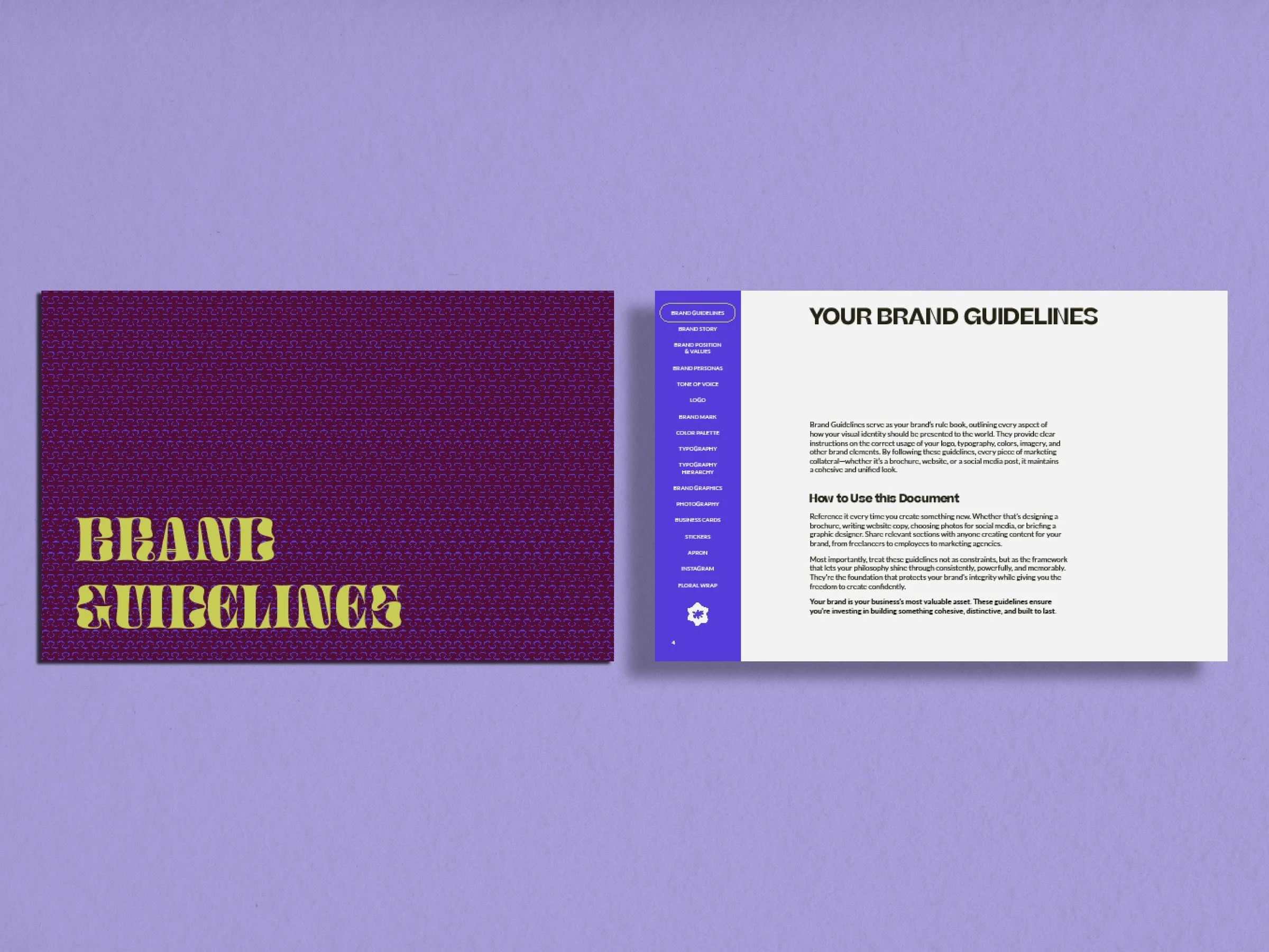
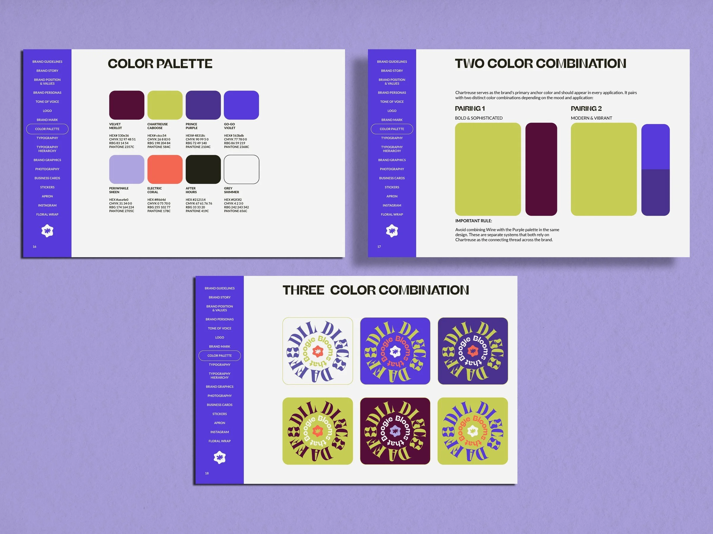
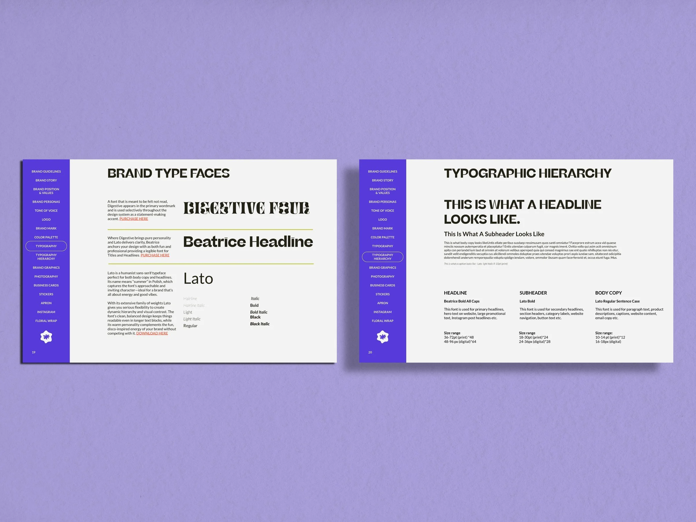
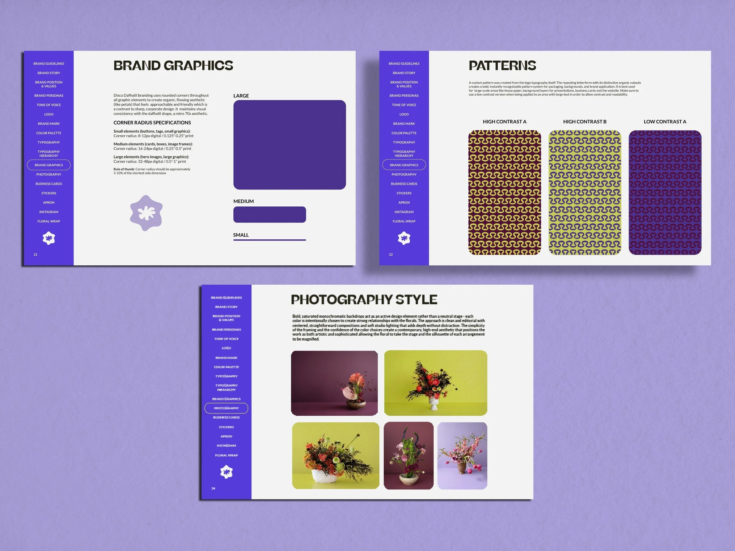
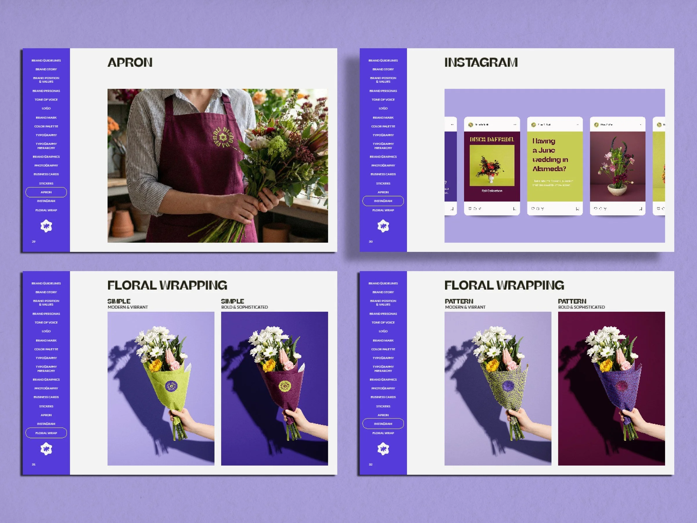
The identity centers on Digestive Four, a typeface designed to be felt rather than read, whose organic cutouts were extracted and tiled into a custom repeating pattern, turning the curves of the font into wallpaper, wrapping paper, and background texture simultaneously. Chartreuse anchors the entire color system, threading through two distinct palette pairings. One bold and sophisticated with Merlot, one modern and vibrant with the purple family, allowing the brand to shift between moods without losing its center of gravity.
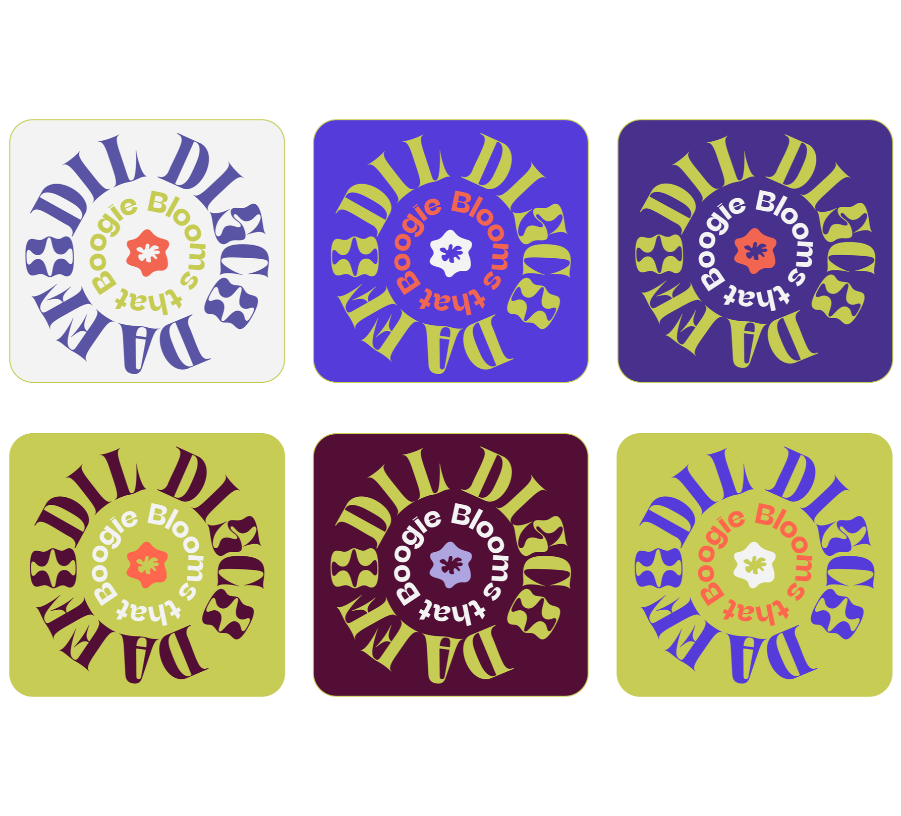
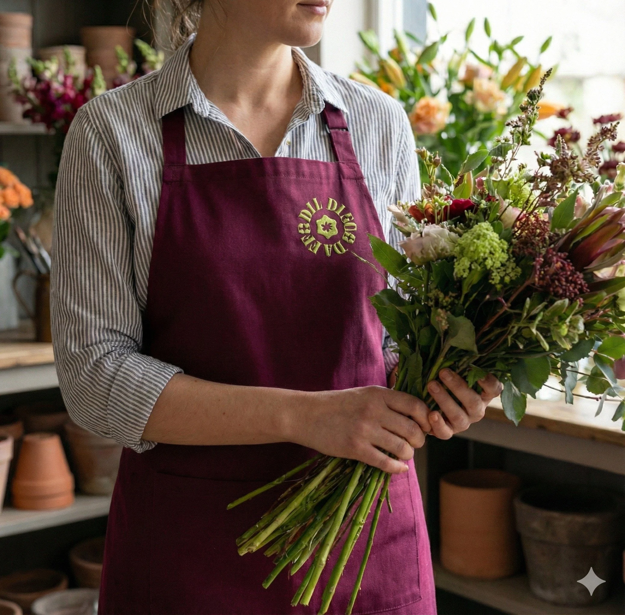
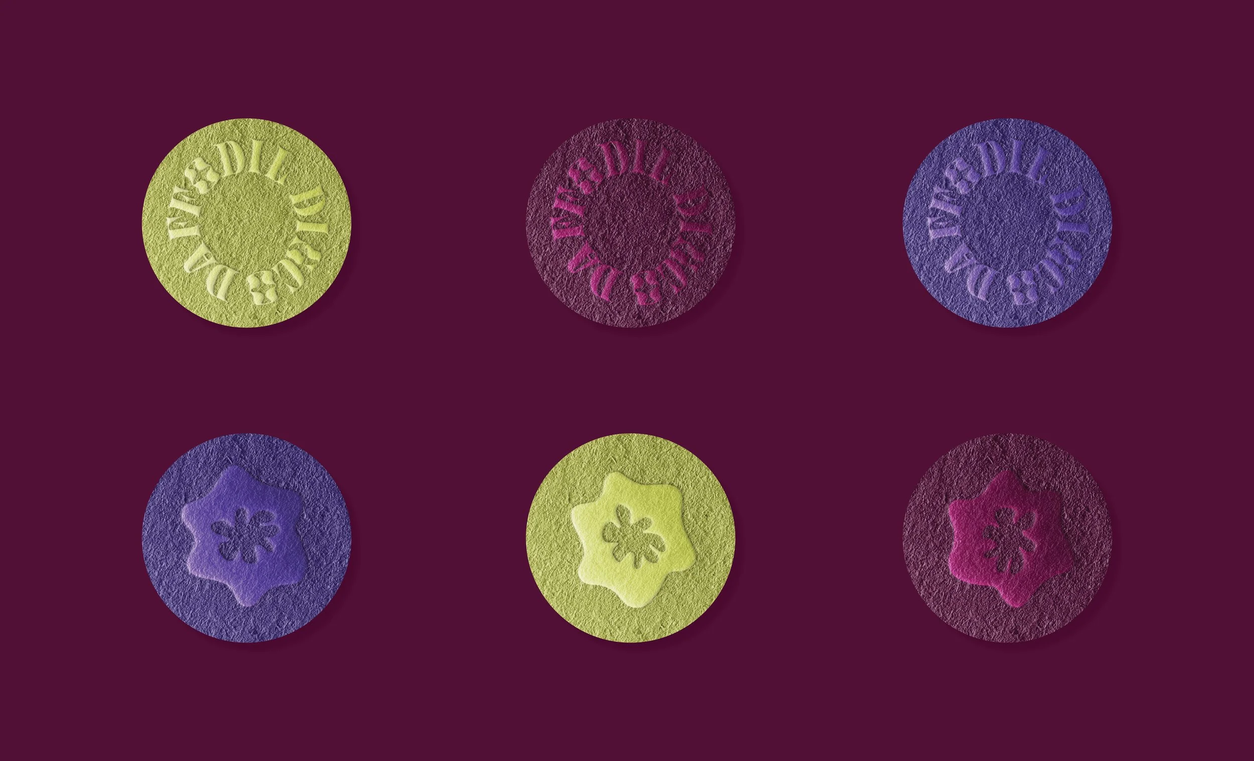
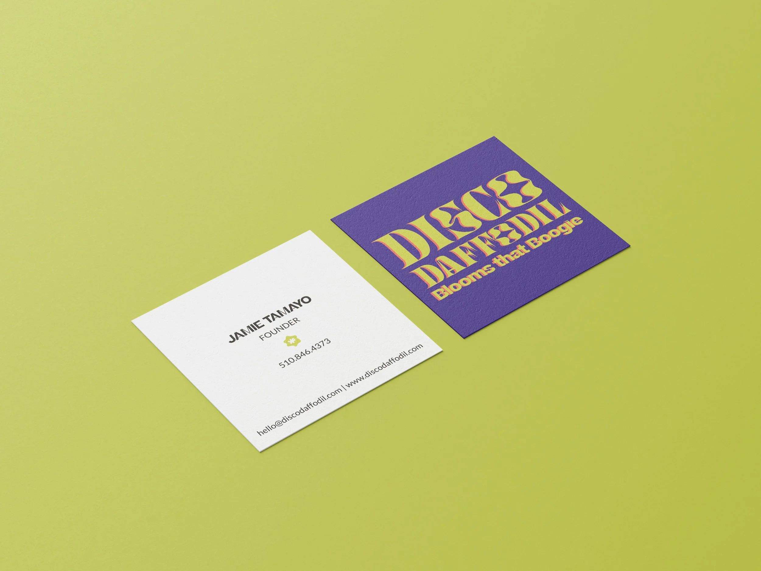
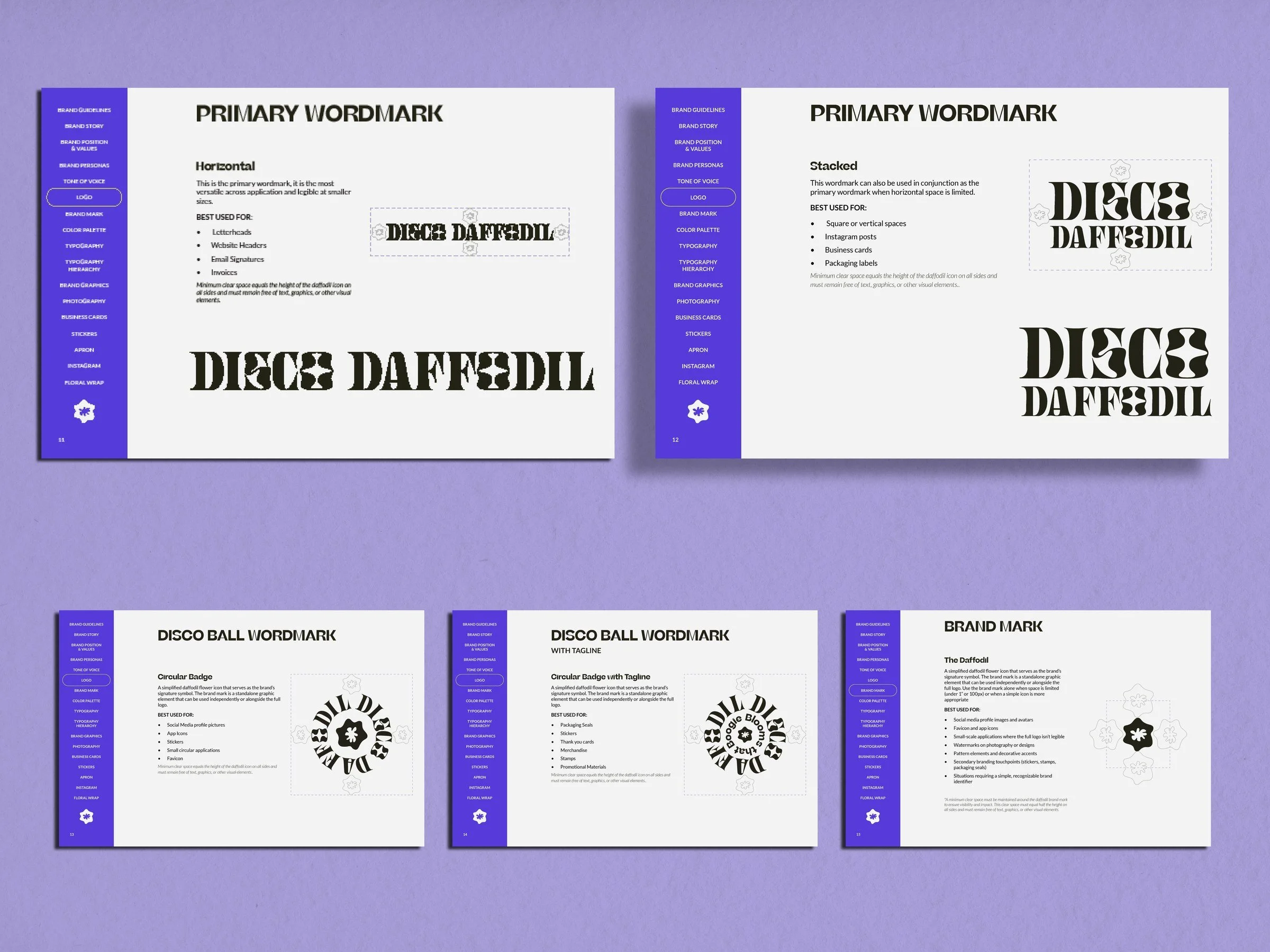
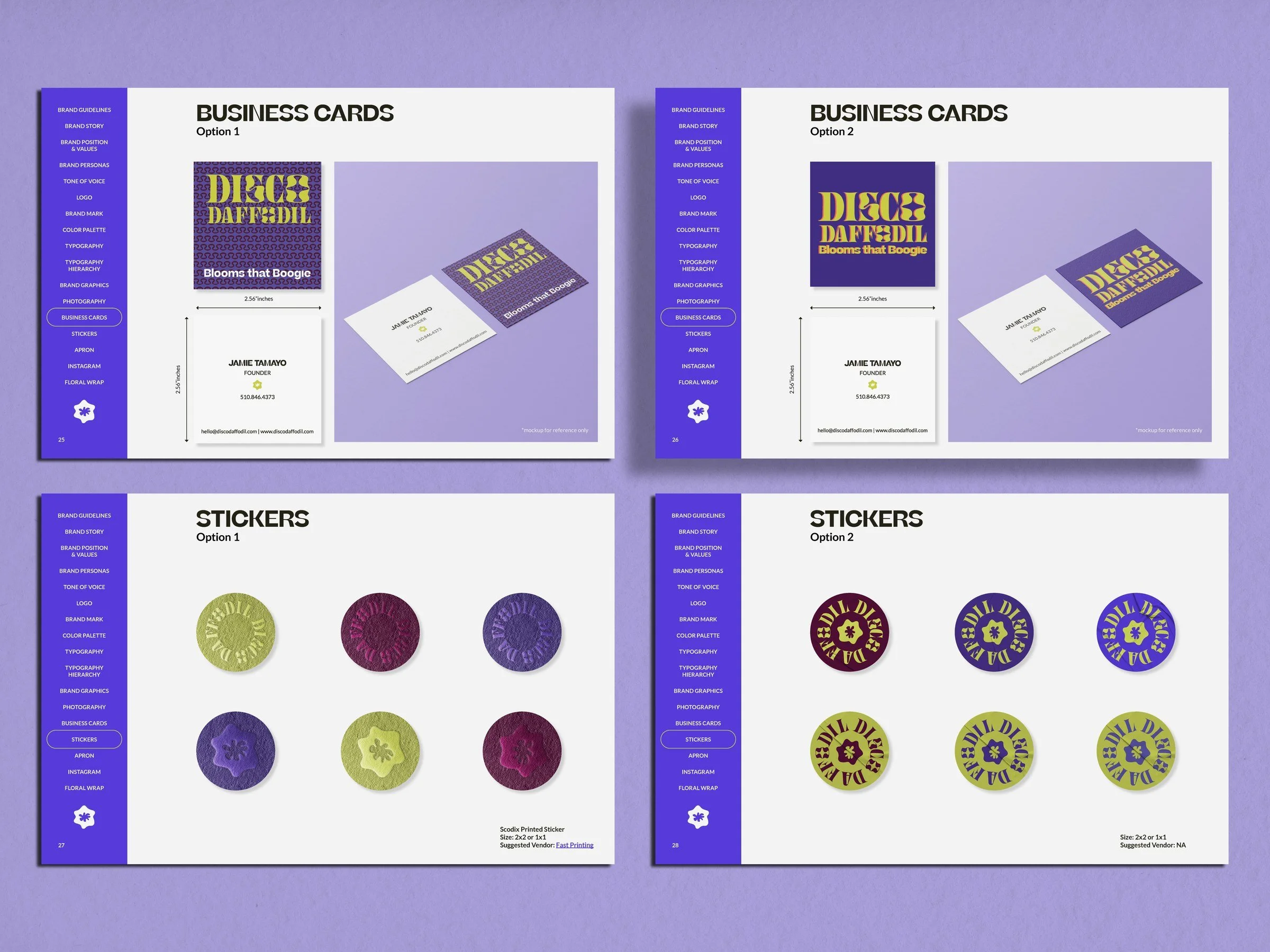
The logo system was built for range: a horizontal wordmark for letterheads and digital headers, a stacked version for square formats, and a circular disco ball badge for packaging seals, stickers, and merchandise. Rounded corners appear as a deliberate design decision, echoing petal geometry. This system is built to feel as alive as the arrangements themselves. Disco Daffodil is for the people who want gasps, who understands that too much might be exactly the right amount, and who know flowers should feel as unforgettable as the moment they're marking.